CakeBox Production Logo (Draft)
Production Logo
A production logo is an image or small piece of writing that is unique to a production company. A production logo is usually created to help brand a production company for easy recognition amongst competitors. It is usually inspired by a certain theme that is associated with the production name. For example, Disney has a huge influence of magical theme, thus the logo has a magical feel to it.
Our Logo: CakeBox Prouctions (Draft)
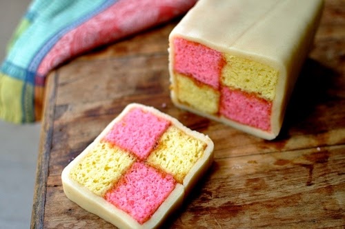
 This is our logo for our productions: "CakeBox Productions." The theme of our logo is inspired by a battenberg cake hence the colour scheme of yellow & pink boxes.The texture of the logo resembles that of a sponge cake due to the name of the production company. Instead of using a rounded squared, we opted for a ridged square shape to make it seem more like a box. As a result, playing on the name of our production company: "CakeBox." The colour scheme of our logo not only reflex the aesthetics of a battenberg cake, but it also gives off subliminal, psychological effects on the viewer. Research into the colour "yellow" shows that it is a colour that has a cheerful, warming effect on the brain. Study into the colour "pink" presents that it has a calming effect on a person's psyche. The combination of these colours used for our logo makes it seem inviting to the audience.
 This is our logo for our productions: "CakeBox Productions." The theme of our logo is inspired by a battenberg cake hence the colour scheme of yellow & pink boxes.The texture of the logo resembles that of a sponge cake due to the name of the production company. Instead of using a rounded squared, we opted for a ridged square shape to make it seem more like a box. As a result, playing on the name of our production company: "CakeBox." The colour scheme of our logo not only reflex the aesthetics of a battenberg cake, but it also gives off subliminal, psychological effects on the viewer. Research into the colour "yellow" shows that it is a colour that has a cheerful, warming effect on the brain. Study into the colour "pink" presents that it has a calming effect on a person's psyche. The combination of these colours used for our logo makes it seem inviting to the audience.

No comments:
Post a Comment